Dashboards are the heart of many SaaS applications, providing users with an overview of critical data and enabling them to make informed decisions. Designing a user-centric dashboard requires thoughtful planning and execution to ensure clarity, usability, and engagement. For tailored solutions, consider exploring professional SaaS design services.
Understand the Purpose of Your Dashboard
Every SaaS dashboard should have a clear purpose. Is it meant to track performance metrics, display real-time data, or provide analytical insights? Identifying the primary function of your dashboard helps prioritize features and design elements. Focusing on the key goals ensures the interface is intuitive and avoids overwhelming users with unnecessary information.
Simplify Data Presentation
Effective dashboards focus on simplicity and clarity. Use clean layouts and concise text to present data in an easy-to-digest format. Group related information together and use visual aids like charts, graphs, and tables to make complex data more understandable. Avoid overloading the screen with excessive details—less is often more when it comes to dashboard design.
Prioritize Customization Options
User-centric dashboards allow users to tailor their view based on their specific needs. Include customization options such as adjustable widgets, drag-and-drop features, and personalized data filters. This flexibility enhances the user experience by allowing individuals to focus on the information most relevant to them.
Ensure Responsiveness
In today’s multi-device world, dashboards must be responsive. Design your SaaS dashboard to function seamlessly on desktops, tablets, and smartphones. A responsive dashboard ensures users have a consistent experience regardless of the device they use.
Use Clear Visual Hierarchies
Highlight key metrics and important data points with visual hierarchies. Use typography, color coding, and spacing to draw attention to critical information. Ensure that users can quickly identify the most relevant details without getting lost in the interface.
Provide Context and Explanations
Help users interpret the data on your dashboard by providing context. Include labels, legends, and tooltips to clarify metrics and visual elements. Offering brief explanations enhances user understanding and reduces the need for external support.
Incorporate Real-Time Updates
Dashboards often serve as the primary interface for monitoring real-time performance. Ensure your design supports dynamic data updates without requiring constant page refreshes. This feature is particularly valuable for dashboards used in monitoring operations or tracking KPIs.
Test with Real Users
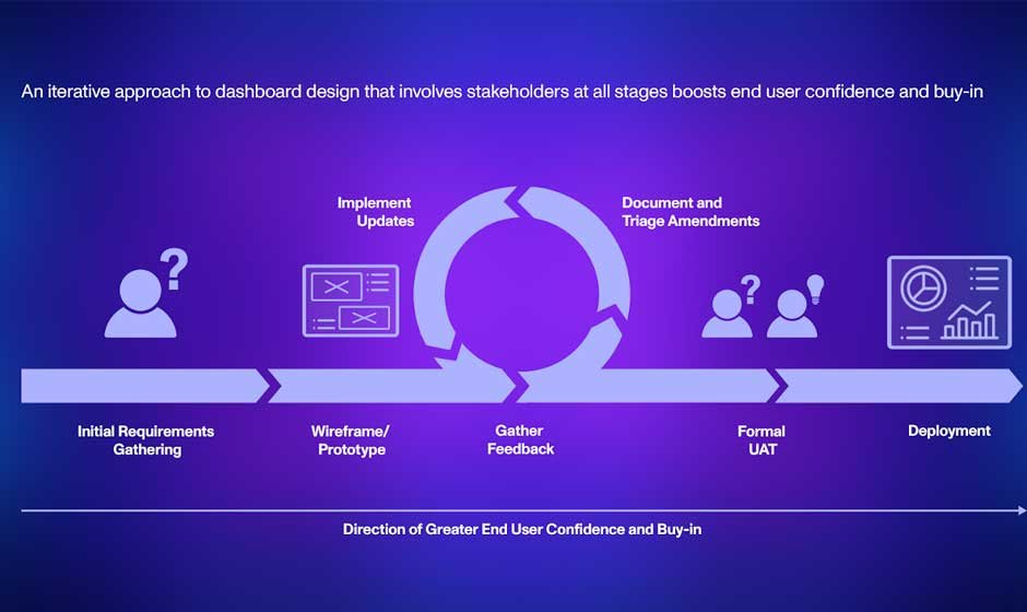
The best way to ensure your SaaS dashboard meets user needs is by testing it with real users. Conduct usability tests to gather feedback on layout, functionality, and overall experience. Iterative testing helps identify potential issues and ensures the final product is both functional and user-friendly.
Focus on Performance
A slow dashboard can frustrate users and reduce engagement. Optimize loading times and ensure smooth transitions between different sections. Efficient performance is critical for dashboards that display large amounts of data or rely on real-time updates.
By following these principles, you can design a user-centric SaaS dashboard with Qubstudio that meets user expectations and enhances the overall experience.


