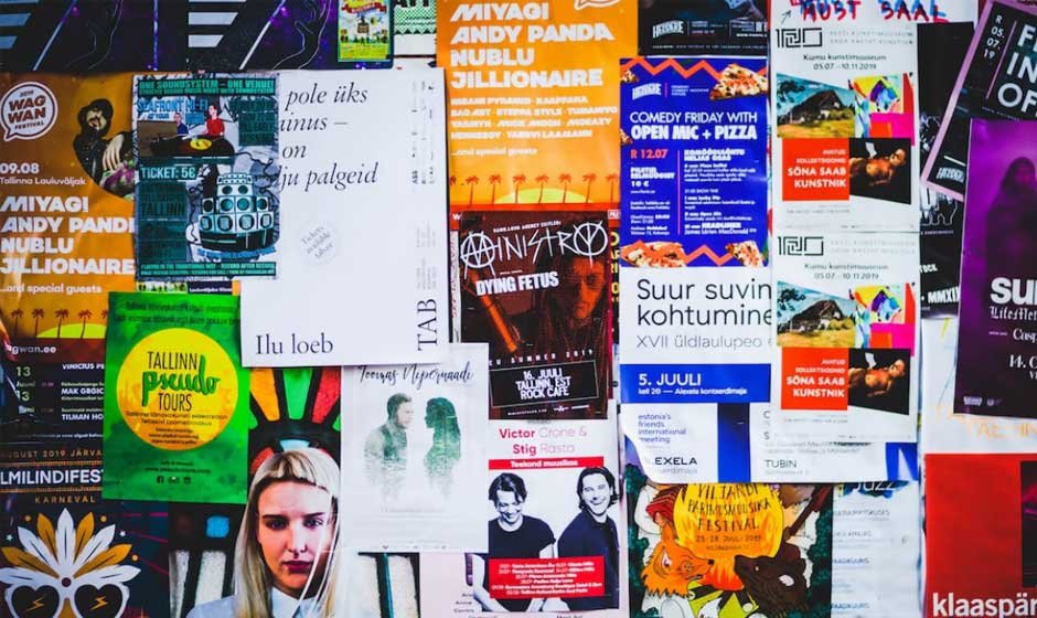
Posters are a classic yet evolving art form—used not only to communicate messages but also to spark imagination and capture attention in powerful ways. Whether you’re designing for marketing purposes, decorating your space, promoting an event, or simply expressing your creativity, posters offer limitless opportunities to think outside the box. What makes poster design particularly exciting is its flexibility—there are no hard rules, only the challenge of making an impression with visuals, layout, and messaging.
In the age of digital tools and online printing, creating eye-catching posters has never been more accessible. But the real magic happens when creativity takes the lead. From experimenting with colors and typography to integrating technology and storytelling, the possibilities are endless. The key lies in understanding both design fundamentals and the bold moves that can elevate a simple poster into something unforgettable.
Let’s begin our journey into poster creativity with our first strategy.
Embrace Minimalism for Maximum Impact
Minimalism in poster design is about stripping away the unnecessary to focus on what truly matters. It’s a philosophy that champions clarity, restraint, and intentionality. When you choose a minimalist approach, you’re relying on visual hierarchy and subtle cues to direct the viewer’s eye. The beauty of minimalism lies in its ability to communicate bold messages using very few elements. Every line, shape, or word must serve a clear purpose.
A minimalist poster often features generous white space, clean and legible fonts, and a tightly curated color palette. This doesn’t mean the design has to be cold or sterile—on the contrary, minimalism can convey emotion and meaning when executed thoughtfully. For instance, a single striking image combined with a short, powerful phrase can create an emotional impact that lingers.
Minimalist posters are also incredibly versatile. They work in various contexts, from art prints to advertising campaigns. Because they avoid clutter, they’re easier for viewers to process quickly—which is crucial when your goal is to grab attention in a crowded visual landscape. When done right, minimalist posters exude sophistication and professionalism, making them ideal for contemporary design needs.
Use Bold Typography as the Hero Element
Typography isn’t just a functional part of a poster—it can be the entire story. Bold typography takes center stage, transforming text from a passive information vehicle into a dynamic visual feature. When used creatively, large and expressive typefaces can evoke mood, convey tone, and even stand in for imagery altogether. Designers often treat bold typography like graphic art, playing with scale, spacing, texture, and motion to breathe life into their words.
Choosing the right font is just the beginning. A powerful type-based poster might feature oversized letters that stretch across the canvas or layered text that breaks traditional alignment to create rhythm and tension. You can also experiment with custom lettering, handwritten fonts, or mixed-case styles to enhance your message’s personality. Contrast is key—pairing a bold font with a more subdued secondary typeface can help establish hierarchy and improve readability.
What makes bold typography so effective is its immediacy. Viewers grasp your message within seconds, and a striking word or phrase can stick in their minds long after they’ve walked away. Whether you’re promoting a film, an event, or a personal statement, letting typography take the spotlight is a tried-and-true way to stand out.
Add Character With Hand-Drawn or Digital Illustrations
Illustrations are a powerful way to inject personality, warmth, and storytelling into your poster designs. Whether hand-drawn or digitally rendered, illustrations can give your work a distinct and memorable aesthetic. Unlike stock imagery or photography, custom illustrations make your poster feel original and thoughtfully crafted, which is especially valuable in a world saturated with generic visuals.
One of the biggest advantages of using illustrations is the flexibility they offer. You can create visuals that don’t exist in real life, depict exaggerated scenes, or develop characters that represent abstract ideas. From whimsical doodles to detailed vector artwork, illustrated posters allow for endless stylistic freedom. They also open up opportunities to play with symbolism and visual metaphors—tools that can give your message extra layers of meaning.
Digital illustration tools make it easier than ever to incorporate custom artwork, but even traditional pen-and-ink sketches can be scanned and integrated into poster layouts. When combined with well-chosen typography and layout techniques, illustrations become focal points that captivate the eye and draw viewers deeper into your concept.
Whether you’re creating posters for an art show, a children’s event, or a social campaign, adding illustration is an excellent way to create charm, convey emotion, and distinguish your message from the crowd.
Experiment With Color to Evoke Mood and Emotion
Color is one of the most influential tools in a designer’s arsenal. It has the power to stir emotion, influence behavior, and set the tone for the entire message of your poster. Choosing the right color palette—and using it with intention—can mean the difference between a design that blends in and one that pops with energy and emotion. Every hue has a psychological impact: red conveys urgency and passion, blue promotes trust and calm, yellow feels optimistic and cheerful, while black adds sophistication and gravity.
Experimenting with color doesn’t just mean picking a few pretty shades. It involves understanding color relationships—like complementary, analogous, or triadic combinations—and using them to create visual harmony or tension. For example, using contrasting colors for text and background can increase readability and draw attention to your most important elements. On the flip side, a monochromatic palette can create a soothing, cohesive look.
You can also use gradients, overlays, and duotone effects to add depth and atmosphere. Don’t be afraid to break traditional color rules if your poster calls for it—unexpected combinations can create a bold, memorable aesthetic. Ultimately, your color choices should support your concept and guide the viewer’s emotional response in the direction you want.
Make Smart Use of Negative Space
Negative space, often referred to as “white space,” is the unmarked area surrounding the main elements of a design. It’s not just an empty room—it’s an essential component of good composition. In poster design, negative space gives your visuals and text room to breathe, helping viewers focus on what matters most without feeling overwhelmed. More than just a backdrop, it’s an active part of the design that helps define shapes, create balance, and enhance clarity.
When used thoughtfully, negative space can make your poster feel elegant, modern, and refined. It draws attention to the content by creating contrast and visual hierarchy. A minimal layout with intentional spacing can be far more powerful than a poster packed corner-to-corner with visuals. It forces you to prioritize information, highlighting what’s truly important and guiding the viewer’s eye naturally.
Negative space also plays a psychological role. It provides a sense of calm and order, which is especially valuable in busy environments like schools, stores, or public transit. Viewers are more likely to engage with your message when they’re not visually overstimulated.
Blend Photography With Design Elements for Visual Depth
Photography is a powerful tool in poster creation, capable of adding realism, emotion, and depth. When used well, a single photograph can capture attention instantly and communicate complex ideas without needing excessive text. But photography doesn’t need to stand alone. The magic often happens when you integrate images with graphic design elements—like overlays, typography, color gradients, and textures—to create a layered, multidimensional composition.
Blending photography with design opens up creative opportunities to stylize your posters in ways that feel fresh and modern. For instance, you can use a photo as a textured background and overlay it with bold text and vector shapes. Or try applying a duotone effect to unify the photo with your color scheme. Even simple techniques like using transparency or clipping masks can drastically elevate the final look.
When the design is complete, bringing it to life in print is just as important as the creative process itself. Choosing a quality service to print wall posters ensures that the final product does justice to your vision, especially when photography is a central feature. The richness of a printed image, combined with thoughtful design, can turn your poster into a true visual statement.
Designing a creative poster is more than just an artistic exercise—it’s an opportunity to communicate, captivate, and leave a lasting impression. As we’ve explored through these fifteen techniques, the possibilities for poster design are virtually endless. From bold typography and custom illustrations to layered textures, cultural storytelling, and motion design, each approach offers a unique way to bring your message to life.
What matters most is intention. Every element on your poster—whether it’s the color palette, the layout, the typography, or the imagery—should serve a purpose. Creativity thrives within structure, and the most compelling posters are the ones that find harmony between innovation and clarity.
Whether you’re designing a single piece or a full series, for a cause, a campaign, or a personal project, let your imagination lead the way. Don’t be afraid to experiment, refine, and iterate. The more you play with your ideas, the more your design voice will evolve.
At the end of the day, posters remain one of the most accessible and powerful formats for visual storytelling. Use that space wisely—and make it count.